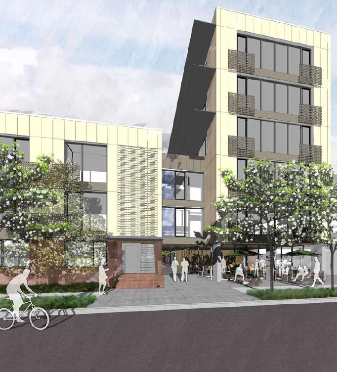
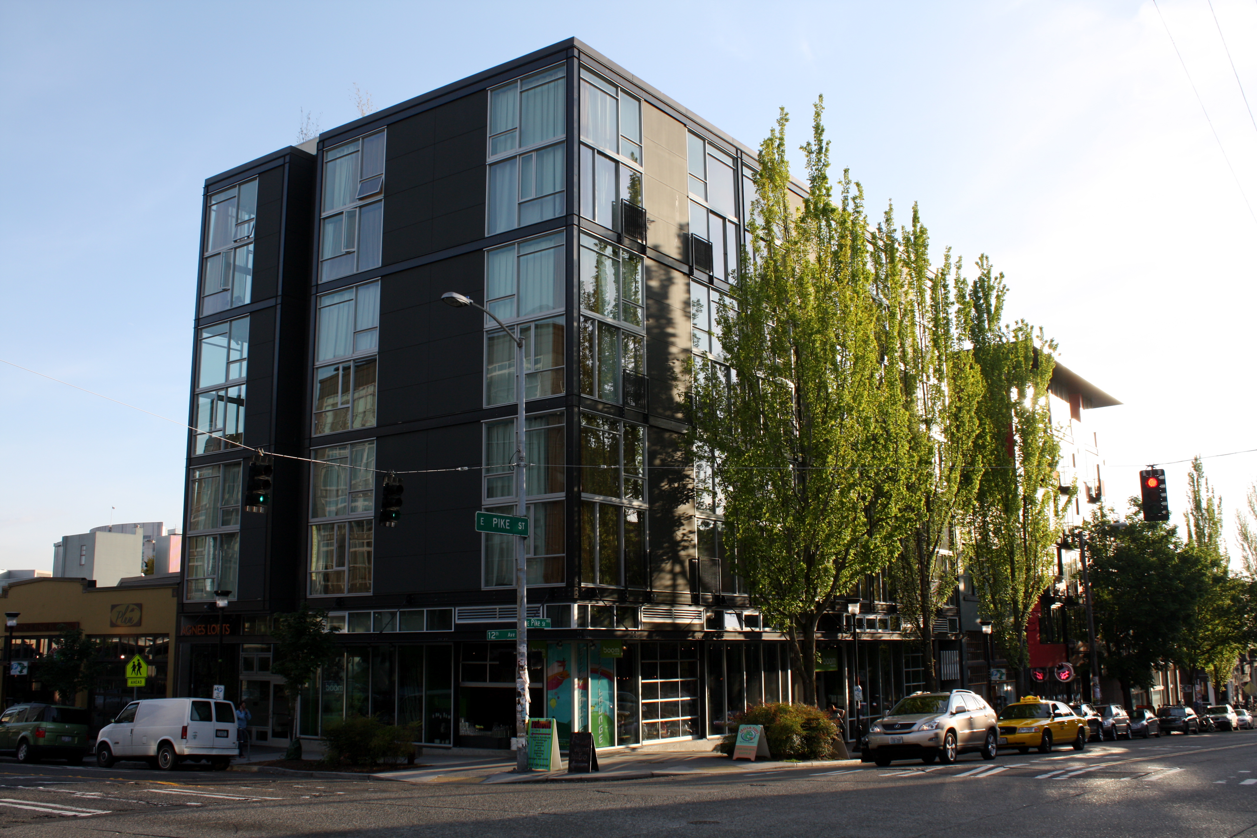
 You like the Agnes Lofts (Photo: Justin Carder)
A couple weeks back we had a post about the mixed-use building planned for the SE corner of Thomas and Broadway. The post generated some serious comments, 44 to date, most of which derided the design of the building and the negative impact it would have on the already deteriorating Broadway commercial strip. Here is a quick sampling of some of those comments:
“too monolith, facade too boring, the new Broadway is looking pretty bad” – Mike with Curls
“Blah. You have a chance to do something different, to push boundries [sic], and to design for a neighborhood that would embrace something a bit different. Why bother paying your architect to come up with the same thing the chaps down the block came up with, when you can just copy it”. – emartin
“Typical, boring, out-of-scale, designed and planned for construction and developer efficiency and profit maximization and future slums.” – designeronthehill
“Whatever charm and character Broadway once possessed is rapidly being flattened and replaced with the above. Nightmarish, really. Soon we’ll have plenty of places for people to live on Broadway, but little reason left to live *there*.” – seymourbutts
And even those who didn’t hate it, didn’t love it:
“Agreed that it is not very exciting but if you want density this is what cost effective design looks like.” – mikewithgirls
Well, here on CHS we like to keep things positive, so rather than just identify what it is you don’t want built in our neighborhood, we thought it would be worthwhile to explore what it is people like when it comes to building design.
A good place to start is the CHS Community Design Preference Survey. The survey, which I encourage everyone to check out, has over 100 pictures of buildings on Capitol Hill and allows members to rate them. Most of the top buildings are older, but a few new ones did make it into the top ten. Weinstein A|U-designed Agnes Lofts, at the corner of 12th and Pike is currently #7, and Pb Elemental’s John Residence further North on 12th is #6. 1310 E. Union Lofts, designed by Miller|Hull Partnership, used to top the charts before falling back to #2.
Earlier I spoke with David Miller of Miller|Hull about the success of 1310 E. Union Lofts. His comments about good design sum up why I think all of the above buildings are appreciated by the neighborhood.
I think there needs to be more of a focus on buildings that are simple and elegant. Some of the new multifamily buildings in Seattle are too complicated with so many different setbacks and materials. I think new buildings need to focus on rationality and simplicity.
These buildings are much clearer architecturally than projects like 230 Broadway or Joule with their mish-mash of colors, setbacks, and materials. Of course, it’s also noteworthy that all of these buildings are much smaller in size and footprint as well.
Of the three modern buildings that top the CHS Design Preference Survey, two were developed by Liz Dunn’s Dunn+Hobbes. Dunn is a long time supporter of the Capitol Hill neighborhood and has been one of the most vocal activists in the fight to preserve Pike/Pine’s character.
Also joining the fight, neighborhood design firm Schemata Workshop has embarked on an in-depth study of Capitol Hill architecture, attempting to codify and catalog good design principles. They hope to put out a full report in the next few months but they sent this collective summary of some important aspects of good design.
Good buildings should have:
- Durable and high quality materials at the pedestrian level …nothing that someone could damage with a swift kick (e.g., cement board or stucco).
- Overhead protection for pedestrians to protected from rain as they move from shop to shop. And also for customers to be sheltered from sun/rain as they sit out while they enjoy their coffee, pastry, meal.
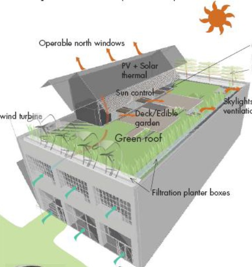
- Been sited appropriately to maximize southern solar access and prevailing winds.
- Four building facades that respond to their particular climatic conditions – solar orientation, shade from adjacent buildings or trees. A building should not have four sides that look the same.
- Authentic materials – no fake brick/stone.
- Demonstrate restraint in the number of materials and colors – this doesn’t mean that a skilled architect can’t create a great building with 10 materials or colors, but we have yet to see this succeed on Capitol Hill.
- Restraint in concept – along the same lines as above. The design team should to pick one strong idea and execute it well. There are too many buildings performing architectural gymnastics that lead to complicated/fussy buildings. Great, historic buildings have a substantial presence of volume, where scale is addressed through removing part(s) of the building mass and will more likely result in an elegant building with a timeless beauty even 100 years from now.
“Long life, loose fit, low energy”. Integrate flexibility and adaptability to future unknown uses; provide long span, high-load capacity structure. Think of the old warehouse lofts that have gone through 150 years of change of use. This is why Elliot Bay Bookstore and Odd Fellows are beautiful, loved buildings after all these years.
The EBBC and Odd Fellows buildings aren’t the only old structures loved by Hillites, and this comparison of historic vs. new construction is the final aspect I want to explore. Whenever I ask people about their favorite architecture on Capitol Hill, I consistently hear praise for the many pre-war brick apartment buildings that dot the neighborhood. Some have argued, myself included, that much of the reason for our infatuation with old apartment buildings is that, simply, they are old. Time allows buildings to mature into their context and while they may have been big and out of place when they were built, today they are a integral part of our understanding of the neighborhood. I predict that with age, the jarring out-of-placeness of some of the newer buildings will soften.
That said, there are certainly some real differences between older buildings and today’s buildings. One aspect is the size of buildings. Many of the pre-war apartment buildings are small, with less than 20 units and only around four stories. This is in stark contrast to some of the over 200-unit apartment/condo buildings we see today, that create long, solid walls along our streetscapes.
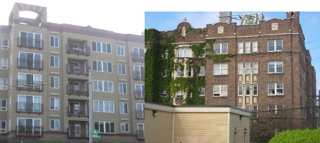
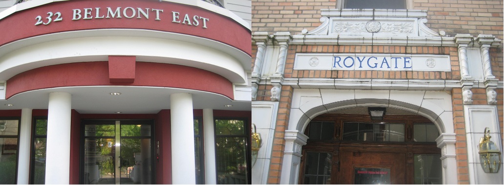
Yet, there are a number of massive old apartment buildings, and even these seem to have more character than the new construction. A lot of this has to do with the human-scaled decoration on older buildings. Take, for example, the below comparison of two buildings off Olive Way.

The newer building has barely any differentiation along its tall wall. In fact, the only ornamentation is the odd sun-inspired arch on the very top. The older building on the other hand is full of decoration. The mission-style parapet, the terra-cotta detailing throughout the facade. Not only do these decorations break up the mass of the building and add a bit of unique character, but they help us understand the size of the building. The building is very aware of its massive size, and the small detailing up at the top informs us of this. Newer buildings lack this human-scaled detailing, making the structures seem detached from the human sphere.
A couple recent projects in Ballard and Fremont have some of this human-scaled ornamentation. Admittedly, I still can’t say these look as good as many of our older buildings, but I think with time these buildings will meld well into their neighborhoods and if nothing else, they are memorable, something very important in this age of mass production.


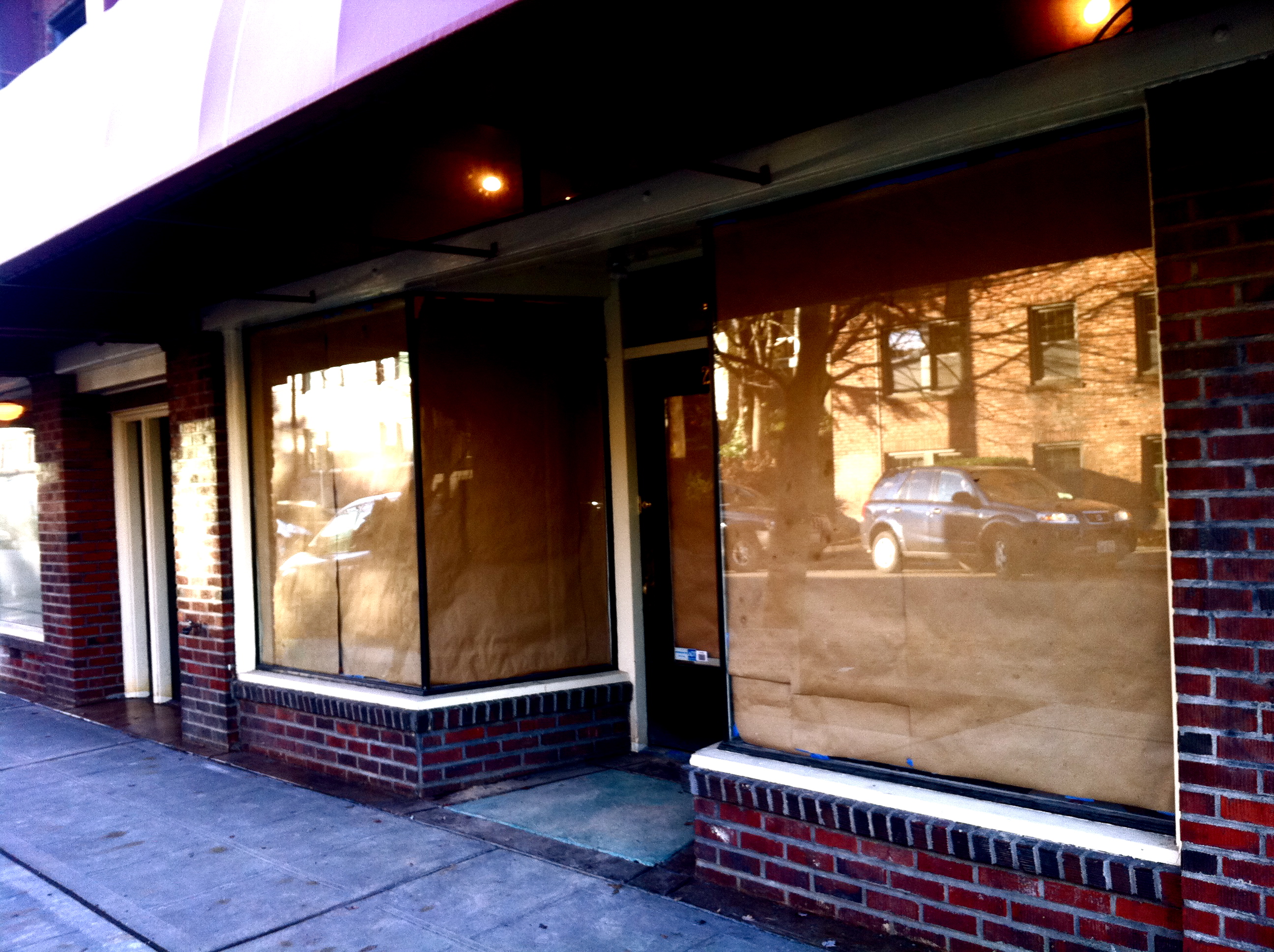 The coming soon Analog (Image: jseattle)


