


 The mission to mitigate a challenging business environment as Broadway undergoes six years of light rail construction is launching another initiative with new banners from a familiar Capitol Hill artist deployed across the neighborhood’s utility poles.
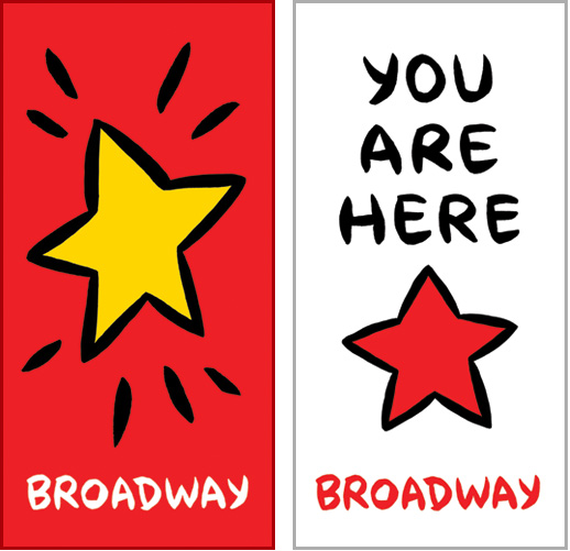
The new banners designed by Capitol Hill arts walk leader Ellen Forney will be a preview of sorts for her work that will eventually appear inside the light rail station at John and Broadway when it opens for operations in 2016.
This latest element to keep the appeal of Broadway strong during the construction is being paid for by the mitigation funds provided in an agreement between Sound Transit and the Capitol Hill Chamber of Commerce. The organizations have also held business seminars and launched the YourCapitolHill Web site (a CHS advertiser) in efforts to assist local businesses.
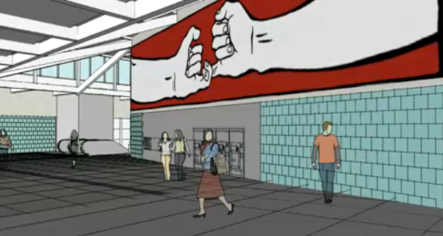
Forney’s art inside the Capitol Hill light rail station will be joined by modified fighter jet sculptures.
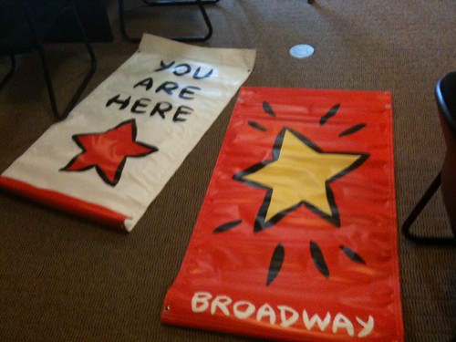
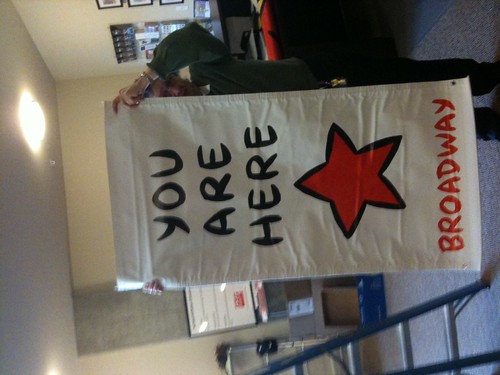
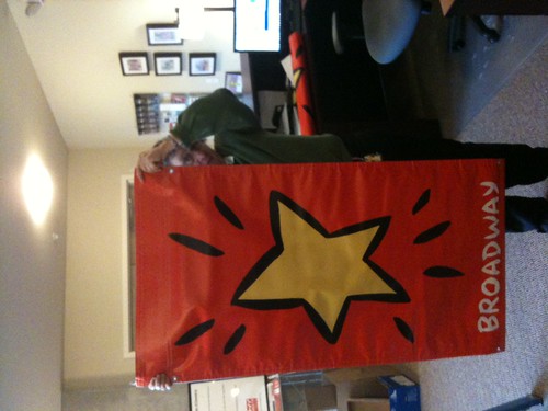
The (beautiful) Ellen Forney banners are a joint production of the Capitol Hill Chamber,Sound Transit and the Broadway Business Improvement Association (BIA). The BIA Advisory Board was instrumental in bringing Ellen’s art to Broadway. I can’t wait to see them up!
Because you’re not all there!
those banners are tacky as hail, and don’t really reflect the spirit of the broadway neighborhood or the people who live there. There should be some kind of public input on putting up things to represent a neighborhood, don’t you think?
Why do the banners look like that? A star? What does the star specifically have to do with Broadway? Why was such a “cutesy” font chosen? How about the tagline? What does it mean? What is it supposed to get people to do? The design seems really cheap and out of touch with the neighborhood.
More effective it seems to me — if the mission is truly to “mitigate a challenging business environment” — would be banners that would advertise the businesses on Broadway or at least the type of businesses that can be found there.
Remind me that I can find some great coffee if I walk just a bit further down the street or some African art supplies if I cross the sidewalk or that there’s a really old diner right in front of my face etc.
I can’t decide what these remind me of more- the Hardees/Carl’s Jr. logo (all the star needs is a smiley face and you’ve got it) or the destination star from mapquest.
It would have been nice if a few different ideas were created and then people could’ve voted. In addition to being, imho, pretty poor from a graphic design standpoint, I don’t think this represents the area at all. They would be just as accurate/relevant (which is to say, not at all) if they were strung along a street called Broadway that ran through Lubbock.
You are the star when you spend …. just how much more hack could you get?
Marketing is not a strong point from the merchants group.
Geez, the banners are just something to add some color to the street and to doll up a galvanized metal pole with wires attached to them.
The banners are not 100 year art. They have a life of a year or two, and then something else comes about. The BIA is responsible for marketing and beautification on the street. The banners seem like beautification, not marketing. It’s just some art. Art is always interpreted differently by everyone. Do the poles look better without anything on them? Just because you don’t get it, why complain about it. They’re just small bits of color.
Maybe the BIA is subliminally trying to court Hardies to open up a burger place on the street?
The use of Ellen Forney for the design, which, in fact ties into the holiday stars, as well as the dancing steps on the sidewalks was quite clever. She’s a well known, well liked Hill artist who has already been commissioned by Sound Transit to do final art both at the main Broadway station as well as the SCCC entrance. Sound Transit and the BIA worked together to do a small thing to try to pretty up the street.
Public meetings? Hardly necessary for a small investment like this that is financed by the BIA and Sound Transit.
Here’s an idea. Get off your computer or I-Phone and buy something on Broadway and give some constructive feedback to the merchants while you’re there, instead of just ragging on here where you can hide.
On a related note, I was told about 9 months ago, by the previous Chamber director, that the City had committed to “wrapping” all the utility boxes on Broadway (those ugly gray things at every intersection) with printed latex designs (I favor some vintage photographs of Capitol Hill, but there are many other possibilities). This would be a great addition to the streetscape, and would also serve as a graffiti deterrent. It has been done in other cities, such as Victoria B.C., and is very successful there.
Michael (director of Capitol Hill Chamber)….Could you please provide an update on what is happening with this idea?
Make’s me think immediately of Carl’s Junior burgers.
saw them on the street today.. definitely boring and tryin too hard. please take them down before pride.. and hopefully they arent up for 6 years.. yawn
Hi Calhoun –
The light box art is going forward and should be up soon!
…a little vomit while admiring the new banners.
Here’s an idea – you express your stoopid opinion and don’t whine about others expressing theirs.
The negativity is kinda high for such an innocuous project.
I actually like them. I recognized Ellen Fornay’s hand right away and it made me smile.
I enjoy Ellen Forney’s work very much. These, however, look like something that Keith Haring might have tagged on a subway advert. I would like to know where the old banners are. You know, the ones that remind the community that historically, this is a gay neighborhood, and that Pride is always present on Broadway. Apparently no longer. Keep on opening up your lash bars and your four dollar mini-bagel shops, Capitol Hill. It breaks my heart.
We need some art? Well Ellen Forney’s the only person who makes that.
I think the banners look great. Eye catching, colorful, and fun. Carl’s Jr.? Really? I did not see that at all, but maybe that’s my East Coast background (I grew up in a big city devoid of such a chain).
And they certainly do not look like the cheap, poorly hung pride flags from last summer. I agree that Broadway should show its gay pride, but unfortunately, we gays, have not supported Broadway enough which has led to the demise of many a small biz on this beloved Cap Hill street. So whether it’s marketing or just beautification, it needs to appeal to a broad cross section of people….for Broadway to bounce back and thrive into the future.
How about just some rainbow banners? That would better fit with the neighborhood and provide some color too …
There are Pride banners scheduled to go up on Broadway for June.
The banners are VERY EFFEECTIVE!- you can read them all the way from one end of “Broadway” to the other. Then reverse and they read the other direction. A pleasure on a rainy Sunday afternoon. Well done, very graphic – Ellen is a talented graphic artist, and these succeed: simple, colorful, a unified visual statement. They will come down and be replaced by something else in another season.
We seem to be having an identity crisis on Broadway: It’s not what it was (whatever that was) and we don’t know what it’s going to be: what do you want to see on Broadway – we are a multi-dimensional/multi-generational/multi-culti neighborhood up here – wake it up!
These are really, really weak. Ugh. I hope they don’t last long, ’cause they ugly.
I like the banners..great splashes of color which help tie the street together.
Thanks, Capitol Hill Chamber of Commerce and Broadway Improvement Association!
I like them too and am surprised by all the arm-chair criticizing going on here. If half the people logging on and commenting here made just a quarter of the effort to get involved in revitalizing broadway and the surrounding area, CH would have a much stronger political lobby. Come on people, get involved!
like some people have already said — and i think it bears repeating — the banners are cool and clear and eye-catching. i think they represent capitol hill perfectly, and i think it’s an honor to have an artist like ellen forney working on behalf of the neighborhood.
I think Forney’s work looks great. A star is a symbol of attainment, it marks a capitol on a map, and it is gender neutral. Her brush strokes provide vibrance and life to a very simple image. These are very pleasing as I walk down Broadway.
Thank you for the bold color.
“those banners are tacky as hail, and don’t really reflect the spirit of the broadway neighborhood or the people who live there.”
You seem overly bitter.
Broadway is the heart of the LGBTQ community in Seattle. Use the rainbow banners or come up with something that actually reflects the community AND doesn’t look like clip-art circa 1997.