


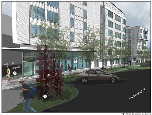
Nearly a dozen members of the community showed up Wednesday night at the second design review for 1111 E. Union – a building which has been a long time moving towards it’s arrival at the crossroads of 12th, Union and Madison. Runberg Architecture group made a lengthy presentation of changes to their initial design including shifting and narrowing the driveway, and moving the entrances and pedestrian spaces to Union, away from Madison.
While there was no love on display for the demise of the Under Arms apartments currently occupying the site, there was also an unusual unanimity of disdain for the proposed apartments on the prominent corner. Both the city design review panelists and the neighbors scolded the drab color scheme of assorted greys, the array of siding materials, discordance with the adjacent architecture and the general scattered massing of the large building. One commenter from a nearby condo did venture to say he liked the color, notably the only compliment the design received.
Ironically, the opposing triangular lot on that crossroads, new home to a resurgent Pony – now appears open for business and their choice of metal siding (stolen street signs) works quite nicely.
I was so sorry to miss this, thanks for the report! I hope they can improve upon some things because this is such an important site.
BTW, the Pony signs are not stolen! CD News just ran a story on how you can buy surplus signs, which is what the Owner did there. He bought like 500 of them in bulk.
I suspected as much, but – it’s PONY -I SO prefer the illusion that an army of young gay men have scoured the city, climbing streetlamps with pliers between their teeth in anticipattion of their favorite bar returning!
Really? This is the best they could come up with? A cold, sterile design that doesn’t fit in with the neighborhood and if it had to be built, would be best suited for a suburban office park.
Grade: F
This building is totally ugly – doesn’t even look like living space but like it belongs in an office park in Sea Tac. Yikes! With all the activity that is going on in Cap Hill – you’d think they would *try* to build an attractive living space for this very visible corner.
Grade: F-
The more people show up at design reviews the more the city can clamp down on mediocre projects. If you still want to comment on this, send a polite email to Lisa Rutzick, the plan reviewer assigned by the city: lisa.rutzick@seattle.gov
Thats really interesting that so many people didn’t like this thing. I have to say that I really like the layout scheme with the small driveway, the retail on Union and 11th and the little mini-plaza by the entrance. I also think the full glass at the front is nice, although i think I would have preferred a rounder edge. I guess the walls are an ugly color but of all things, that’s quite possibly the easiest thing to change over the years. Also facade is just facade. To “fit in” you would have to make it brick bottomed, which is pretty much the epitome of suburban mixed use. I tend to hate brick facade because it has no architectural merit anymore. Its just a lame desire for true brick buildings, which haven’t been built in like 80 or more years.
Ps. Thanks Web for writing this up! I could tell you this in person but I want the whole world to know my gratitude!
i’m pretty sure the street signs at pony aren’t stolen. the city is replacing its old signs, and you can buy them from their surplus store for about five bucks each. maybe they got a bulk discount.
This building is yet another nail in Seattle’s architectural coffin.
http://www.cheapshitcondos.com